

Summary:
As an intern for the DBVI, I designed a rebrand and materials to enhance community engagement and communications.
- The Ask: Create accessible, engaging infographics and promotional materials for DBVI’s programs, ensuring inclusivity in branding.
- The Challenge/Problem: DBVI needed to make information more accessible and engaging for a diverse community while supporting programs and initiatives.
- The Solution: As a Communications Intern, I developed accessible infographics and promotional materials, aligning with DBVI’s standards, and contributed to the rebranding process, including logo and identity redesign.
My Roles:
- Communications Intern
- Departmental Coordination
- Graphic Design
Background:
The Department of Blind and Vision Impaired (DBVI) works to enhance the lives of individuals with vision impairments in Virginia by providing services and resources to help them live independently. They aim to ensure that their programs and services are accessible and that information reaches a broad audience.
The Challenge:
Through research and collaboration, I worked closely with multiple departments to understand the programs they support and gather key information. The primary objective was to simplify the language of promotional materials, ensuring they were both accessible and easily understood. This was essential to comply with state mandates requiring materials to be at a 6th-grade reading level, whereas DBVI’s materials were previously at a doctorate-level. I identified key areas where design changes could improve engagement with the blind and visually impaired community, as well as parents, particularly for student-based programs.

Insight:
Language can be a barrier for some to get the right access and resources

Strategy:
Empower the DBVI’s voice
Work:
- Designed accessible infographics for DBVI programs


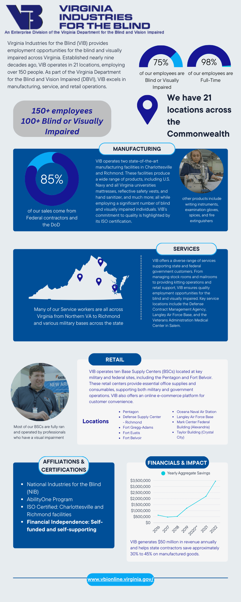
- In my proposal I started with my survey data to illustrating the pain points and noted the changes that the DBVI needed to make which were visual identity, internal communication, and external communications.


- Here are my designs for the DBVI rebrand. I took a modern approach by updating the font and color palette. I chose brighter, more vibrant tones to create a fresher look while maintaining a professional feel. The new font is bolder and sleeker, with wider spacing to improve readability and recognition. Additionally, I introduced a streamlined tagline: Educate, Empower, and Excel — a refined version of the original Education, Employment, and Independence — to make it more impactful and memorable.


- As part of the rebrand, I also proposed ways to simplify and clarify some departmental names to reduce confusion. By streamlining the language and ensuring each name accurately reflects its function, the goal is to make it easier for individuals to navigate the organization and understand the services offered.
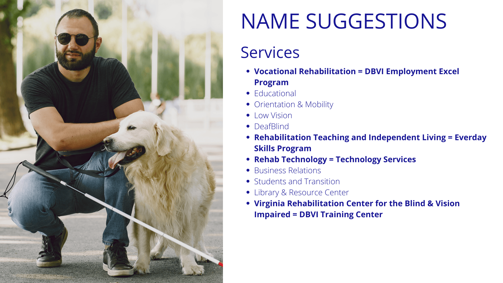
- Ensured all departmental materials were accessible to people with vision impairments, contributing to a more inclusive communication strategy.

Results/Applications:
My work helped DBVI increase its accessibility across departments, fostering greater community participation and engagement. The rebranding also gave a glimpse into what DBVI could look like as a more modern and inclusive organization, making its services more recognizable and accessible to those in need. This approach can be applied to other brands and companies seeking to modernize their image and improve inclusivity—helping them connect more meaningfully with diverse audiences while streamlining communication and services across internal and external channels.
